PayByPhone: Conversational AI Map Search
A 0-to-1 conversational AI search layer for map based parking discovery, replacing manual filters with natural language.
Role
· Product Designer
Team
· Solo project
Duration
· Add duration
Year
· 2026

The Challenge
Cluttered map, no filters
Give drivers a way to search parking by intent, not by scanning tiles or fighting rigid filters.
Urban parking apps ask a lot of drivers. When you're running late, stressed, or in a part of town you don't know well, you shouldn't have to scan a cluttered map or dig through filters to find a spot. That was the exact problem with PayByPhone's map search. There was no way to filter results at all, so people were left scrolling and guessing.
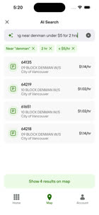
This project introduces a conversational AI search layer built directly into the map. Instead of tapping through filters, users can type something like "cheap parking near Denman for 2 hours" and the app pulls out what they meant, turns it into editable filter pills, and instantly re-centers the map around the best matches.
The Strategic Leap
Skipping straight to conversation
The old app had no manual filters at all, so this wasn't a redesign. It was a jump straight past the dropdown menus most apps still use.
Moving beyond legacy constraints
Instead of building the kind of dropdown menus most apps have used for years, we went straight to a conversational search layer. It's the kind of jump you'd expect moving from a slow, high consideration flow, like buying insurance, into something low friction and on the go, like finding a parking spot in the next thirty seconds.
Knowing where not to use AI
We split the experience into two paths: routine parking, where someone already knows their zone code and just wants to enter it fast, and exploratory parking, where someone is searching in an area they don't know well. Routine users need speed, not a conversation. Exploratory trips were where people got stuck on cluttered map tiles, so that's where we focused.
Solution Architecture
Eliminating the translation tax
Say what you need, in about the time it takes to say it out loud.
The search entry point sits right on the map, kept simple and understated, with a few dynamic prompt starters like "Try one of these" for anyone who isn't sure what to type. From there, people can just type naturally: "cheap parking near Denman for 2 hours." Sliders and dropdown filters ask people to translate what they actually want into form fields, and that takes effort most drivers don't have to spare while they're driving. Natural language skips that translation step.
Trust & Transparency
Exposing the model's thinking
AI can feel like a black box. Showing the parsed pieces as chips gives people something to check their request against.
As someone types, the system breaks their sentence into filter pills in real time. Results that show up with no explanation tend to make people uneasy or suspicious of them. If one part is wrong, people can delete or adjust just that piece instead of retyping the whole thing over again.
You type
"cheap parking near Denman for 2 hours" becomes Near Denman · 2 hr · $5/hr, three chips you can edit or delete on their own.
Technical Approach
Validating reality over static frames
Prototyping in code instead of handing off static screens and hoping engineering fills in the gaps.
Rather than handing off static Figma screens and hoping engineering could work out the runtime logic on their own, I built the interactive prototype in code, using tools like Claude Code. That meant testing real state transitions myself: how the map re-anchors, how chips get deleted, how search latency actually feels when it isn't simulated. It's a different kind of design work, but it means the handoff comes with real answers instead of guesses, and it saves engineering time that would otherwise go into figuring out edge cases from scratch.
Edge Cases & Resilience
Designing for failure states
A search feature that only works on the happy path isn't really finished.
AI models don't always get it right. We built explicit fallback flows for the moments when the model can't find an exact match, or gets an impossible request, like "free parking right next to the stadium." Instead of a dead end, people see a soft fallback that keeps them moving toward an actual parking spot instead of stuck staring at an empty results screen.
Instead of a dead end
"We couldn't find exact matches under $5, but here are the 3 closest options within a 3 minute walk."
Reflection
What I would carry forward
This project pushed me past dropdown thinking and into something closer to product reasoning under real uncertainty.
Working on PayByPhone taught me that an AI feature lives or dies on trust, not on novelty. The technical part came together faster than I expected once I understood the constraint. The harder part was deciding when to show the model's reasoning and when to just get out of the way. I made a lot of small calls about tone, about what counts as a good enough match, and about how much control to hand back to the person doing the search. Those calls ended up mattering more than the interaction pattern itself.
What worked
Prototyping in code instead of static frames. It forced me to test the feature against real ambiguity instead of a clean happy path, and it surfaced edge cases that a Figma flow would have hidden until launch.
What I would do differently
Bring in real parking data earlier. I validated the interaction pattern well, but pricing and availability edge cases only showed up once I started feeding the prototype messier inputs. Next time that goes in from day one.
Final Design
The shipped experience
From typed intent to editable chips to a re-anchored map, in a few taps.

1 · Search entry point
Type what you need →
2 · Entities extracted
Editable filter pills appear →

3 · Map re-anchors
Results centre on the match →

4 · Session starts
One tap to confirm parking
Prototype
See it in motion
A quick look at the working prototype, not just static frames.
I built this in code so I could feel the timing, not just describe it. The loop below runs through the real flow, opening AI search, watching plain language turn into removable filters, and watching the map redraw around the picks. It is compressed and silent for the page, but it is the actual interaction, not a mockup of one.
Drop the looping prototype clip here
1 · Ask in plain language
Someone types what they actually want, not a form field.
2 · Filters become editable chips
The system's interpretation stays visible and correctable.
3 · Results reprioritize live
Every added filter narrows the list without a full reload.
4 · Map reanchors around the pick
The spatial view catches up to the conversation instead of the other way around.
Success metrics
How we're defining success
Here's how we're measuring whether this is actually working.
Time to transaction
Seconds from opening the app to starting a parking session during exploratory searches.
Search to session conversion
Percentage of people who complete a parking session after an AI search, compared to traditional map browsing.
Cognitive load
Fewer repeated taps and back and forth checks while scanning the map manually.
Case Study