Post-Purchase Offers
I designed and launched PayByPhone's first third-party ad product: the experience layer on a machine-learning offer engine. The challenge was monetizing without disrupting the app's fast parking flow, solved through research, live A/B testing, and a design that lets the model learn when to stay quiet.
Role
· Product Design Lead
Team
· 1 PM, 3 Devs, 1 Financial Analyst
Duration
· 6 months
Year
· 2024

49%
higher revenue from the winning placement
$1M+
annual revenue
0→1
PayByPhone's first third-party ad product, built from scratch
Challenge
An algorithm picks the offer. Design makes it welcome.
PayByPhone wanted to unlock a new revenue stream from the most engaged moment in the app: right after someone finishes paying for parking.
The opportunity was to surface partner offers, chosen in real time by a third-party ML engine, at a high-intent moment. The difficulty was doing it without eroding trust in the app's primary job. Anything that felt like an ad blocking the parking task would undermine the utility people rely on, so the feature had to stay optional, well timed, and easy to ignore.
How might we
…design a seamless, optional way to present offers without disrupting the parking experience for users?
Explorations
Two decisions, validated before launch
Every decision sat on the same tension: an engine optimizing for revenue versus a user who just wants to park and go. I designed for both, then let research pick the winners.
Decision 1 · Offer placement

Overlay offer
✗ Rejected
Forced an interaction, read as a barrier
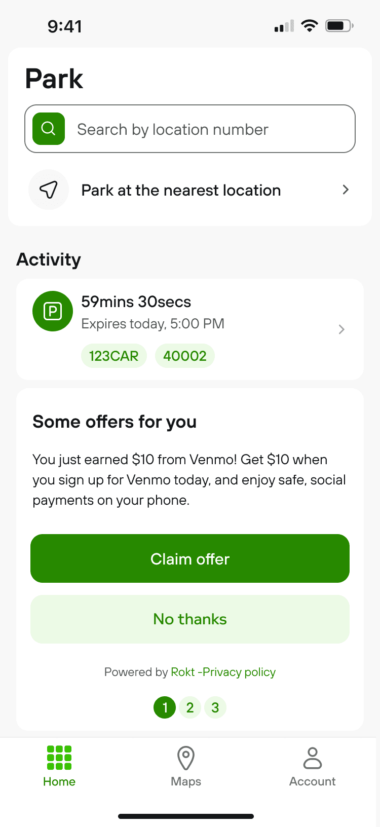
Embedded offer
✓ Selected
Moderated interviews showed a clear preference for the embedded offer: users felt reassured their parking was finalized first. The overlay read as a mandatory barrier.
Decision 2 · Progress indicator
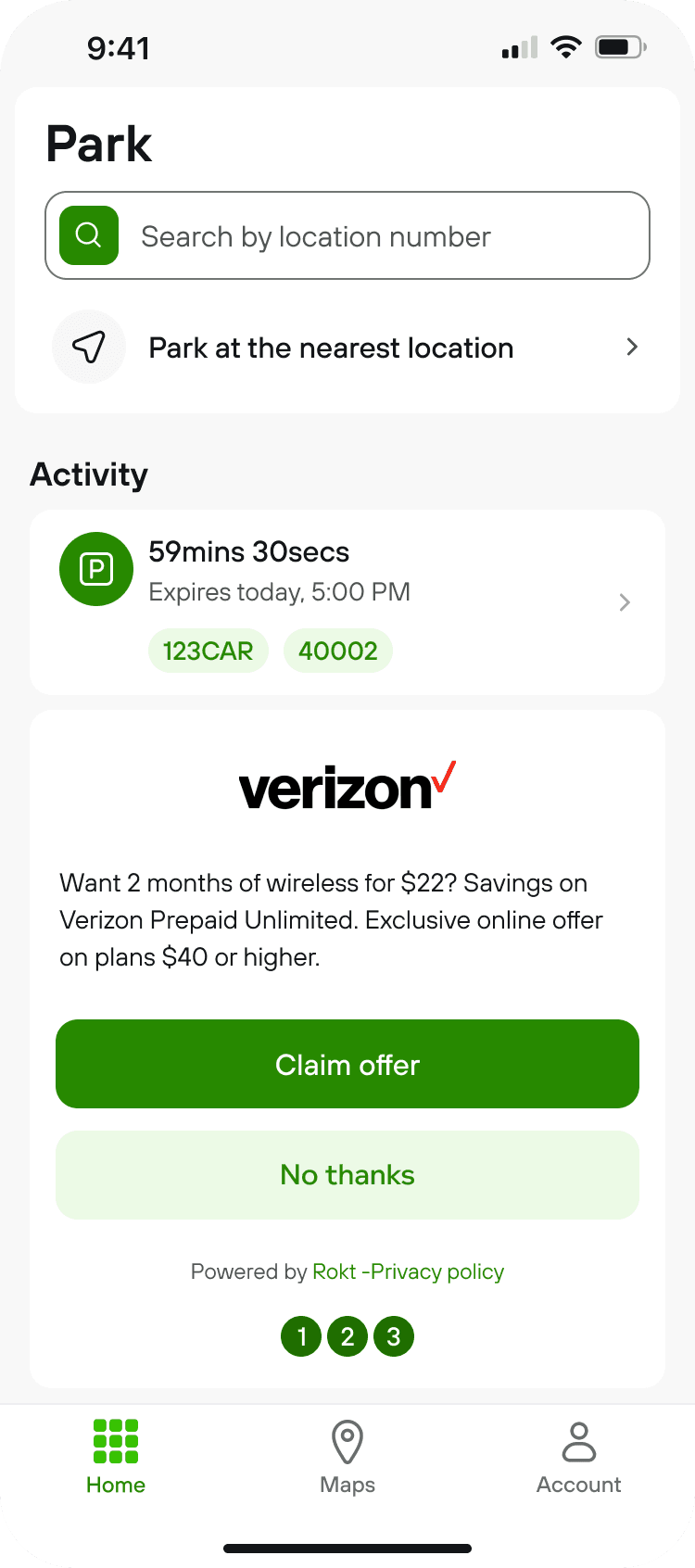
The engine serves one offer at a time and cannot return to a seen one, so swipeable carousels were out. I designed a forward-only progress cue that matched how the ML system delivers offers.

Numeric 1 of 3
✗ Rejected
Did not signal you cannot go back

Three-circle tracker
✓ Selected
How I tested it
An unmoderated usability test with 120 participants, with the overlay as the control. I measured:
Time on task
Task success
SEQ, single-ease rating
SUS, system usability
The overlay added measurable overhead, while every design scored Excellent: SUS above 90 (80.3 and up counts as "excellent") and SEQ above the 5.5 industry average.
Decision: ship Embedded Stacked and Embedded Side-by-Side, and A/B test them at launch.
Success metrics, set before launch
So a live launch could be judged honestly. Exact targets are withheld under NDA.
App Store reviews
Comparable to similar features in the app.
Support requests
Request-to-transaction ratio on par with parking.
RPM
Revenue per 1,000 impressions, at or above target.
Positive engagement rate
At or above target.
Final designs
An embedded offer that respects the flow
The shipped design places the offer under the active session card once parking is paid, uses the three-circle tracker for multi-offer sets, and was later brought fully in line with the updated design system.


Plot twist
Usability testing proved comfort, not conversion
Usability testing told us the design felt effortless. It could not tell us whether people would actually tap an offer, so I took the decisions live.
The measurement gap
Usability scores measure friction. Revenue depends on real tapping behavior, which only live traffic reveals.
The response
I ran two live A/B experiments to tune how the ML-served offers were presented, capturing the real tapping behavior the engine optimizes against.
EXPERIMENT 1: CTA PLACEMENT
Stacked vs side-by-side buttons
Hypothesis: A stacked CTA would drive better revenue than side-by-side because it commands more of the user's attention.
Control: Stacked - Winner

Variant: Side-by-side

49%
higher revenue impact from the stacked CTA
EXPERIMENT 2: PROGRESS TRACKER
With vs without the tracker
Hypothesis: Showing the progress tracker on the first offer would increase awareness and navigation across multiple offers.
Control: With tracker - Winner
Variant: Without tracker

1.9%
revenue lift from showing the progress tracker
Relevance & AI
Designing for an ML offer engine
Offers were never random. Across three years partnering with our PM and ML vendor, we shaped how the engine ranks, suppresses, and adapts offers, while I designed the human layer so an algorithmic choice felt relevant, optional, and quietly responsive to each user.
Adapts to your engagement
Tap an offer type and the engine shows more like it. Ignore offers for a while and the format escalates once, to an overlay, to cut banner blindness, then goes quiet to protect trust.
Surfaces what you like
Offers are chosen from the kinds of things a user has engaged with before, so the slot leans toward relevance instead of random inventory.
Stays on-brand
We set which categories the engine may and may not show, excluding anything off-brand like sports betting, so a partner offer never undercuts the trust the app relies on.
34%
Restraint beat exposure
Dismissals and capped frequency both feed suppression. Capping to one offer a day actually raised revenue per impression, fewer offers, more money.
Anatomy of the offer
Every element earns its place
A closer look at the shipped offer card, and the reason behind each choice. Nothing is decorative: every element balances revenue, clarity, and the user's trust.

1 · Offer headline
Framed as a pick for the user rather than an ad, so the slot reads as a service and sets the right expectation before they read on.
2 · Single value line
One scannable benefit, so a user mid-task gets the point at a glance instead of parsing dense ad copy.
3 · Stacked primary CTA
The stacked layout won the live A/B test for tapping ease and visual prominence, and became the default rollout.
4 · "No thanks" control
A guilt-free way out keeps the moment optional. Its taps are tracked, so repeat dismissals teach the engine to show that user fewer offers.
5 · Three-circle progress
Signals a short, forward-only set, since the platform cannot return to a seen offer. Clearer than a "1 of 3" counter.
6 · Placement under the session card
Appears only after payment is confirmed, so the offer never blocks the core parking task.
In motion
See the offer appear after payment
A short walkthrough of the post-purchase moment, from confirmed parking to an optional offer that never blocks the task.
Results and celebrations
Monetization that earned its place in the flow
The embedded placement, stacked CTA, and progress tracker delivered verifiable success across business and user metrics, proving that high-impact monetization can layer into a core utility flow.
$1M+
in actual annual revenue, within the first year
49%
revenue lift from the winning placement
Met
reached the Rokt engagement benchmark in North America
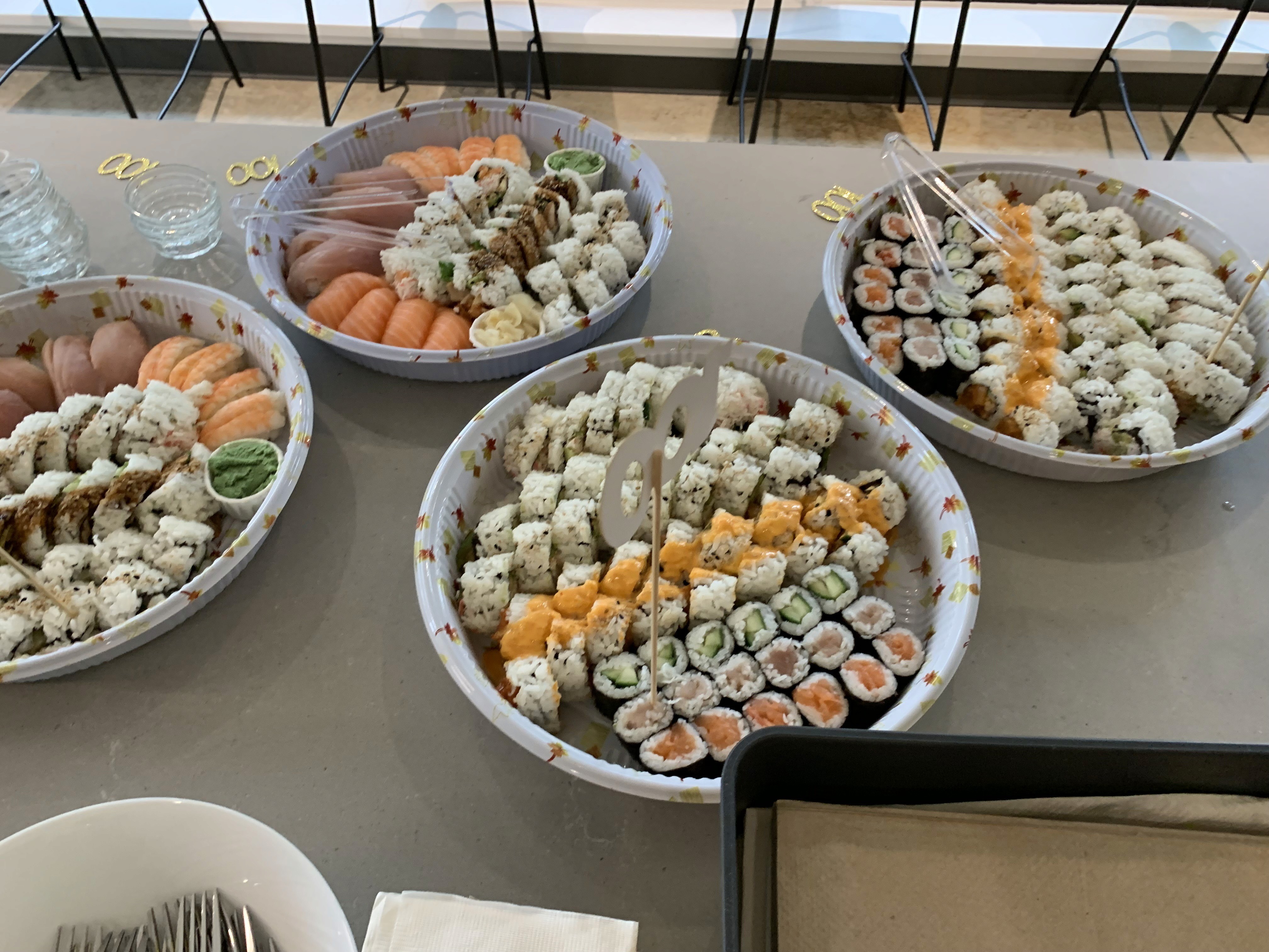
When monthly offer revenue crossed C$100K for the first time, the whole team got together to celebrate. A few moments from that day:




Concept
What an AI-native offer could look like
What I'd push for next
A one-tap onboarding prompt so the model learns a new user's taste faster. A visible "Based on offers you've liked" cue so the relevance is legible, not invisible. A richer "No thanks" that captures why (not relevant, already have it, too many), turning a blunt dismissal into a precise training signal. And a defined "negative sentiment" guardrail for the suppression model to optimize against.
Here's how a few of those next steps could look. Concept explorations, not shipped, that make the model's relevance, restraint, and feedback visible in the offer itself.
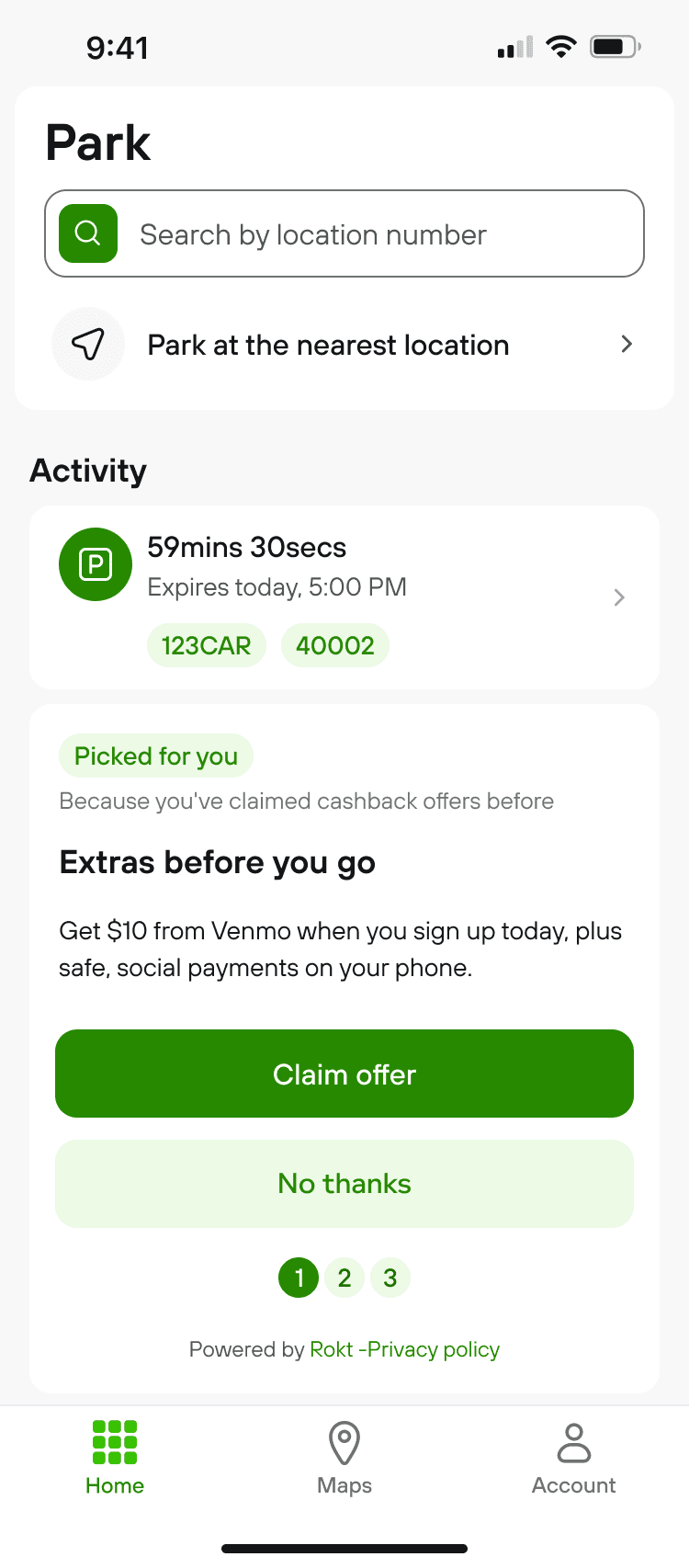
A · Relevance & explainability
A "Picked for you" cue and a reason, so personalization is legible.

B · Smarter "No thanks"
Decline reasons that teach the model what to suppress.

C · Suppressed state
When nothing clears the quality bar, the slot stays quiet.

D · Cold start
A "what are you into?" picker to bootstrap a new user.

E · Confidence states
Quieter and generic when the model is unsure.
F · Adaptive overlay
When the embedded offer is ignored, it escalates to an overlay once, then goes quiet.
Reflection
What I carry forward
Monetization can live inside a core utility flow when it stays optional, lands at a high-intent moment, and is validated with both lab and live data. Designing for a machine-learning system meant designing its guardrails and its feedback loop, the human judgment around an algorithm, not just the surface it shows. Comfort in testing never guaranteed tapping behavior, and only live data told the full story.