MoneyPrep
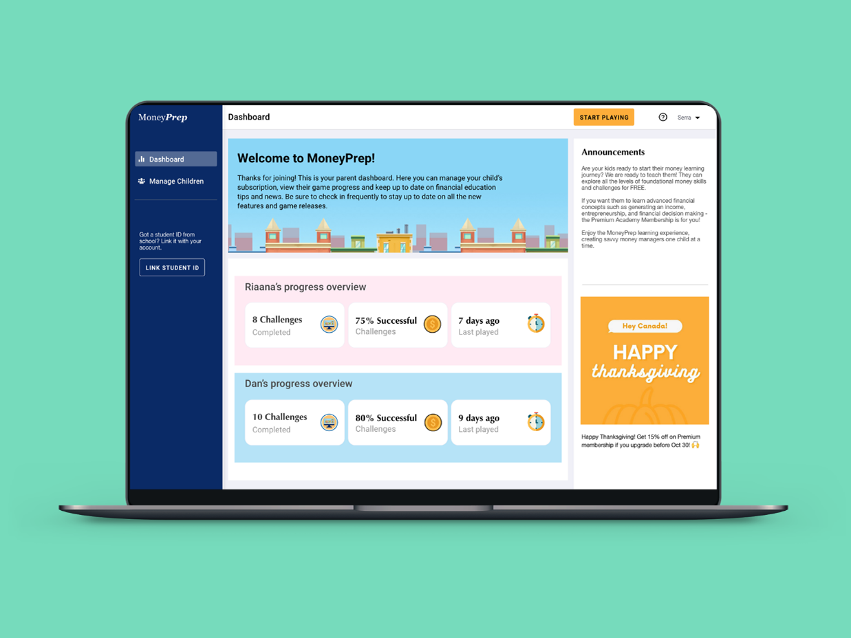
MoneyPrep is an e-learning platform that aims to provide financial literacy to kids through its interactive approach to learning. At MoneyPrep, I was responsible for redesigning the existing features, website and designing new features for the web application.
I was the sole UX/UI Designer on the team. I work closely with the founders, and developers to understand the business goal, identify user needs, and understand the technical constraints.
My Role: UX/UI Designer
Duration: 3 months
Team: 1 Designer (myself), 3 Developers
Tools used: Adobe XD, Zeplin, Photoshop, Illustrator
To comply with the non-disclosure agreement, I have changed some of the quantitative data and omitted some information in this case study. All information in this case study is my own and does not necessarily reflect the views of MoneyPrep.
Objective
My goal of this project was to refine the UI of MoneyPrep’s responsive website, and redesign the sign up-login flow. This can help to increase the user engagement which can lead to increase in the Parents' and Teachers' registration rate significantly increased.
User Flow (Signup/Login): Before
User Flow (Signup/Login): After
Problem
I observed user journey recordings on Hotjar and I found out that the majority of the users found it difficult to navigate through the website.
Design Goals
1) Update content hierarchy to provide users with the most important information & benefits initially.
2) Refine visual hierarchy and make content easily scannable for users.
3) Make consistent sign up & login screens throughout the web app and reduce the number of steps
Redesign Process: When Parents are primary target users
Flow diagram (Before)
There are several things which can be improved in the existing flow. The major one is that it takes 4 steps to sign up and create a child account before kids can use the game for an interactive learning.
Signup-login flow before
Home page (Before)
Home page design wireframes
Final Home page design
Home page design- Before (Left) and After (Right)
Sign up flow (Before)
1)There are two logins on the home page, one is for kids and the other one is for parents and teacher. Two logins on home page create confusion for the users. The call to action button "Kids play now" give indication to parents that kids can start playing immediately. However, when they land on kids play now screen, they are asked to log in as kids without any information written that they first need to sign up by going back.
2) There is a middle screen in sign up flow, which increased one more step to sign up.
3) When parents click on sign up, they are asked to fill two forms back to back.
4) The Kids play now screen looks different from rest of the product and users felt they arrived on a different product.
Initial Explorations: Option 1
In my initial explorations, to remove the middle step, I decided to combine Parent and Teacher tabs for sign up and Parent, teacher and child tabs for login. However, after discussing with the engineering team, I found out that all our apps are developed on separate portals and it will not the priority at this stage to combine all the portals into one. So this option did not work.
Option 2
I discussed with the founders and we decided to make "Parents" as our primary target users. This helped me to remove the middle step in the sign up process and add a link to teachers sign up on parents sign up screen.
For parents sign up screen, I added a stepper to create parent and child account. This can help parents understand the number of steps left before they can reach to the game.
I decided to give the zoomed out and faded version of game background to make it exciting for parents to sign up for game. I added characters of the game half shown on sign up screen and decided to show completely on login screen to build excitement among users. However, after speaking with the engineers I found out that its would take long time to do absolute position for these characters at this stage, and so we decided to remove the characters for this version.
Parent's Sign up flow- Before (Left) and After (Right)
Kid's Login
Kid's Login after Student ID feature got introduced for teachers
Teacher registration- Before (Left) and After (Right)
Sign up Login Flow: After
1. I redesigned the home page and kept only one login in button instead of two (Login and Kids play now) to avoid confusion
2. I removed the middle screen from sign up flow and added a middle screen for login. This can help people to sign up faster and middle screen in login can help combine two logins into one to avoid confusion.
3. I combine the two separate child and parent forms into one screen with steppers.
4. I added the option to login or sign up as parents on kids login screen to make it convenient for parents if they accidentally go to kids login screen.
I kept the same background on all the login and sign up screens to give a unified flow and to avoid confusion among users.
Designs (after)
Educators page - Before (Left) and After (Right)
Membership page - Before (Left) and After (Right)
TESTING
After the release, we waited for 2 weeks to see the results. I observed users' behaviour in Hotjar recordings and I also visited Google Analytics to see the sign up and login success rate of parents, teachers and kids.
HOME PAGE DESIGN (AFTER TESTING)
RESULTS: The new home page increased the sign up rate of parents and teachers significantly.
However, we still had a lot of support request regarding what exactly MoneyPrep is and if it is free to use. I also observed Hotjar recordings and found out that there were some elements on home page which users were not using it. Therefore, I decided to refine the home page.
1) We updated the copy in hero section to make it more inclined towards "Game".
2) I added the introduction video right under the hero section to give users clear understanding of what they can expect from MoneyPrep.
3) I changed the images of kid to game GIFs to give users clear understanding of what they can expect from games.
4) I changed the design of testimonial section to show 3 testimonials (parent, teacher and kid) together at once.
PARENTS SIGN UP
RESULTS: Parents sign up completion rate increased significantly.
I checked the Hotjar recordings and found out that a lot of the parents were getting confused on the 2nd screen of parents sign up, which is creating a child account. They were getting confused between username and child name.
I decided to group the information in different section to make it easier to understand. Here is the new design.
RESULTS: We tested this new parents sign up, and so far the support rate reduced significantly.
Kids login
In the previous design, kids were getting confused between the home and school account after we introduced Student ID feature. We received a lot fo request regarding kids login. Also, kids were incorrectly typing the student ID. They were typing spaces or sometimes in typing either in caps or small letters.
Therefore, we decided to make the login for kids more visual. Also, we decided to make the text fields case insensitive for kids. Here is the new concept of kids login.
Results: We tested this new kids login, and so far the support request rate got reduced significantly even for kids login.
Next Steps
The next step would be another round of testing and refining the design based on the data.


